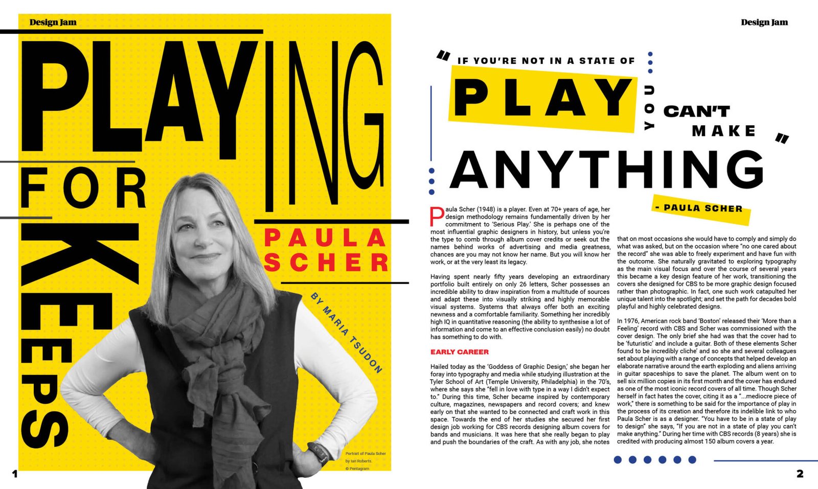
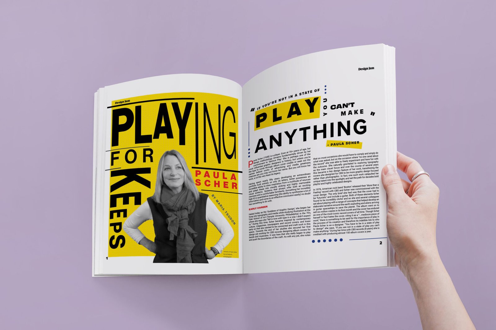
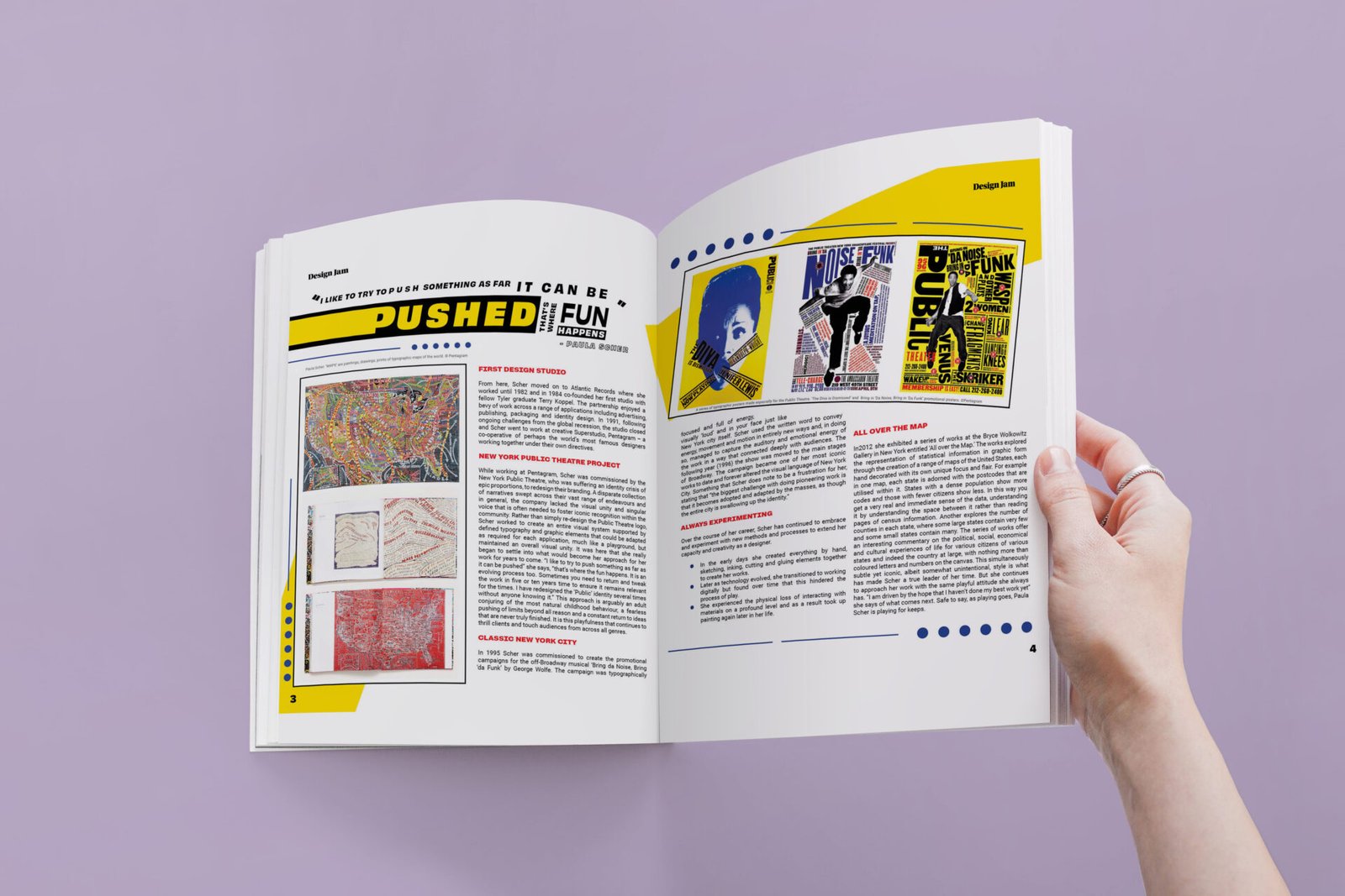
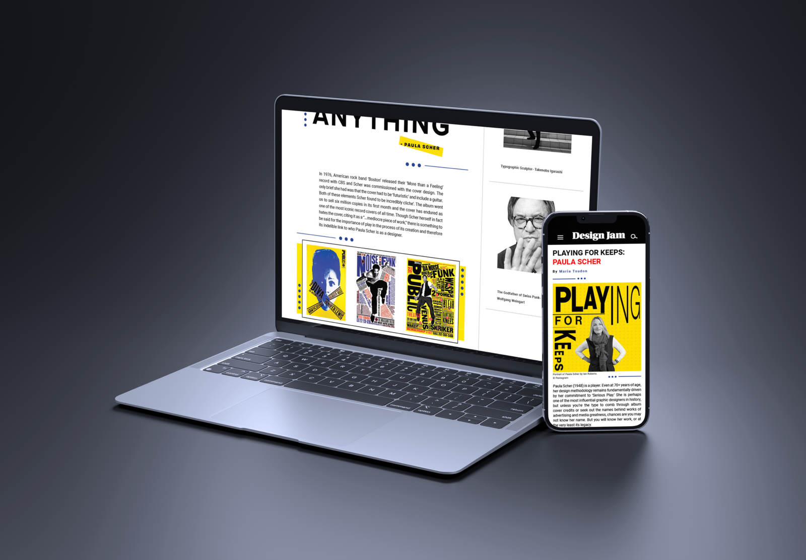
This project focused on creating a visually engaging magazine spread celebrating typographer and designer Paula Scher, with a layout that could later be adapted for digital use. I wanted to design a spread that played with typography in a way that felt dynamic and experimental while still following strong graphic design principles.
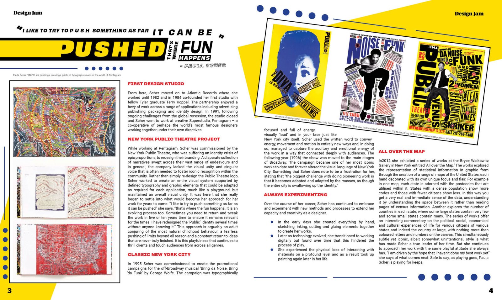
I used a limited colour palette to create bold contrast and clear focal points throughout the layout. Blue dots act as visual guides that lead the reader across the page, while yellow slabs establish additional points of emphasis. To honour Scher’s own stylistic approach, I kept her portrait in black and white, reflecting the monotone imagery often seen in her work, allowing the typography and background elements to bring the energy and excitement.
The final design is intentionally simple yet visually striking, with purposeful focal points and strong typographic play, capturing Scher’s influence while keeping the article fresh, modern and engaging.